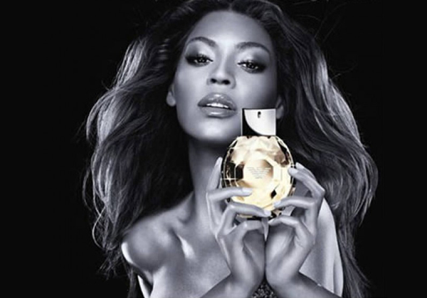
With its power to make colors more dramatic, remove distracting elements and alter models’ body sizes, Photoshop has an allure that few businesses can resist – especially when it comes to fashion. That said, sometimes tinkering with and manipulating an advert in the hope of making your image really “pop” can go too far.
Tweak a color here, whiten the eyes there, slim down a waist size or two… one change leads to another, and before you know it, your ad’s visual is almost unrecognizable from the original image. Or even worse, your overstretched graphic designer misses a phantom hand, leaves a model with mismatched eyes, or adds a third armpit – and you become an online laughing stock!
Here’s a look at the 15 most ridiculous fashion ad Photoshop faux pas we could find…
