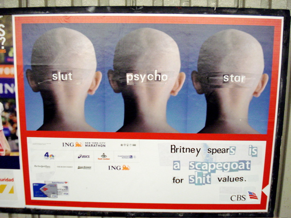
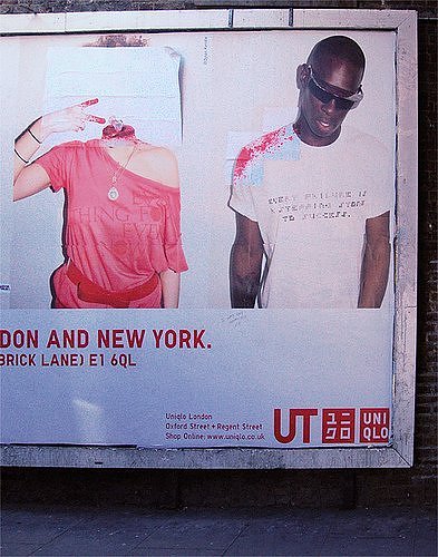
Advertisements are a pervasive part of life, visible everywhere. Yet commercial breaks, paid reviews, product placement in movies and television, and sponsorship in magazines can all be avoided by simply switching off. The only inescapable advertisements, for anyone who isn’t a hermit, are the billboards and posters that fill your vision wherever you walk or drive in the Western world. With this in mind, a small band of vigilantes have been tackling the phenomenon with subvertising, which, according to Wikipedia, is “the practice of making spoofs or parodies of corporate and political advertisements in order to make a statement.” Here are ten of the greatest examples of this guerrilla form applied to advertising posters.
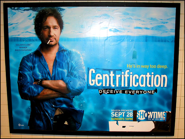
10. Razorboy: Gentrification
A New York subway advertisement for the popular television show, Californication, is here transformed into social commentary. With the addition of dollar bills, the divide of wealth is subtly hinted at. The real issue here is not a fun escapist fantasy of fast living and false drama in California; instead it is a social divide in New York City, the challenges and problems of gentrification – where wealthy young people move into poor, culturally-rich areas and drain the area of everything that made it unique, while pricing locals out of the market. It’s the work or Razorboy, more of whom later…
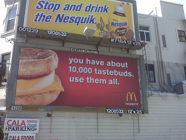
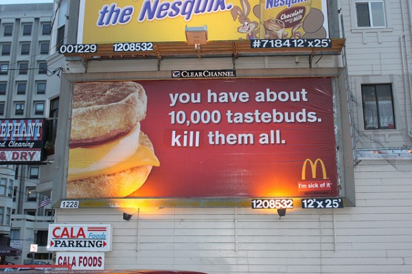
9. BLF: McDonalds
The Billboard Liberation Front acts as a satirical advertising agency. Its “partners” come looking for a more innovative, realistic approach to advertising. However, it is highly unlikely that McDonalds would see the positive side of this altered campaign, which the BLF says “[embraces] the traditional American values of conformity, convenience, and mediocrity.”
It isn’t simply the large type, “kill them all,” that puts forward a subversive message. On a second look, the viewer notices that the “I’m lovin’ it” motto of McDonalds, as popularized by Justin Timberlake, has been replaced with “I’m sick of it.”
8. Photoshop on the U-Bahn Line
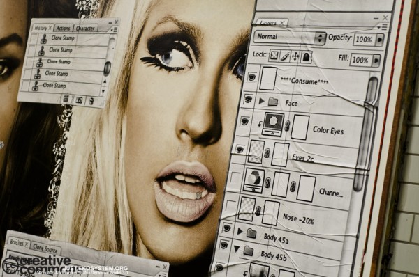
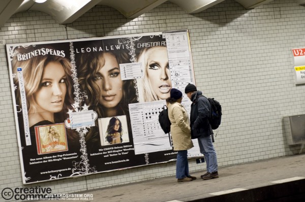
Three beautiful young starlets staring out at morning commuters with bedroom eyes and pouting lips. Everything about them is perfect; not even a single flaw is visible, such is the high quality of these large-scale images.
Unaltered, the billboard is a siren call to consume and thereby aspire to such perfection. Yet the simple alteration – pasting on the familiar toolbars and option trees of Adobe Photoshop, the premier image manipulation tool – gives it an altogether different message. This perfection is not real and you are being sold a lie, it says.
7. Fox News: We Deceive, You Believe
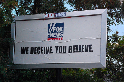
Fox News is a controversial media outlet. Depending on who you talk to, they are indeed as fair and balanced as their current motto would have you believe – or they are a hate-mongering lie machine that will stop at nothing to make a buck while attacking Democratic political aspirations. Given the 2003 court case, where Fox News successfully defended themselves on the grounds that they were not obligated to tell the truth, the distortion of their old tagline, “We report, You decide,” to read, “We Deceive You Believe,” not only has a poetic quality but is a pointed reminder of the fact that they have an agenda of their own.
6. Banksy: Light Group Nightclub
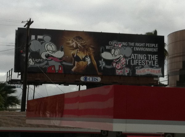
When Banksy tagged this advertisement for The Light Group’s nightclubs, he inadvertently gave them a whole lot more publicity than they had paid for – so much so that when the billboard management company tore it down, The Light Group complained. Banksy used the image of a half-naked woman dancing as a background for a lascivious Mickey Mouse and a drug-impaired Minnie Mouse. This could be a criticism of Disney itself, but could also be an attack on the consumerist culture that is epitomized by these characters. Like all great works of subvertising, the image suitably provokes contemplation and discussion.
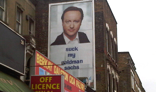
5. UK Elections: David Cameron
The 2010 UK General Election saw the leader of the Conservative Party staring down upon the voters from on high with slogans designed to elicit trust and popular support. In some views the posters looked disturbingly like a Big Brother scenario or a Stalinesque Russia, where the Dear Leader’s face is omnipresent. Some activists obviously disliked the Conservatives, as well as their perceived links to the banking institutions that had profoundly damaged the economy. This alteration to the slogan is a quick and simple solution, narrowly avoiding obscenity but getting its point across.
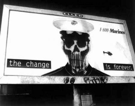
4. US Marines: The Change is Forever
The original billboard pictured here showed a clean-cut young man in the iconic uniform of the marines. Stark, unadorned type gave the simple message, “the change is forever.” As a piece of advertising it certainly did its job with a minimum of fuss. Yet the subvertised billboard is similarly simple and striking. The only change has been to replace the young man’s face with a stylized skull. The new message is clear, subverting the tagline to convey a much more sinister meaning. This image is so perfect as a piece of subvertising that it has been used in guides to billboard “improvement.”
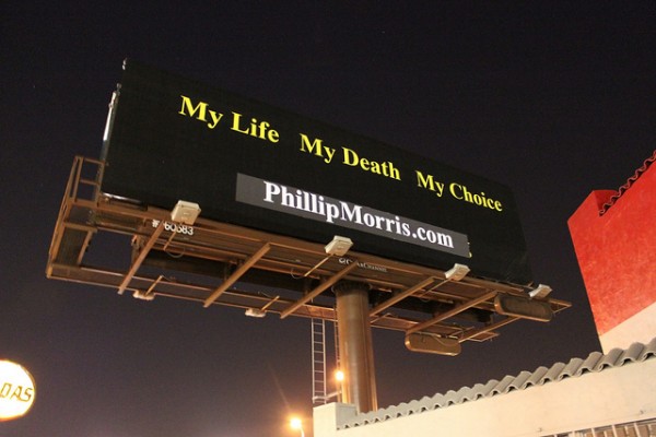
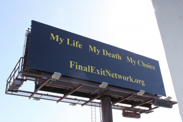
3. BLFront: Philip Morris
The Billboard Liberation Front (see also, entry 9) has also had tobacco company Philip Morris in its sights – as the BLF puts it, as one of their “clients.”
The BLF attributes these words to Philip Morris’ company’s representatives: “This campaign drives home that message where, if you are gonna die, might as well do it on your terms. Just like our Marlboro Men did.” The original advertisement was for finalexitnetwork.org, a right-to-die organization. The replacement of this web address with that of Phillip Morris makes a stark statement on the consequences of an individual’s right to smoke.
2. Decapitator: Headless Corpses
The East London Decapitator has taken many victims, mostly the young and carefree. However, The Decapitator is thankfully not a serial killer, in the style of Jack the Ripper, but a vigilante who takes his tools to the billboards that pervade Britain’s capital city, attacking advertisements and the models that personify brands.
Using surprisingly sophisticated techniques, The Decapitator targeted fashion advertisements and Sex & The City movie posters. The graphic, shocking changes to normally bland consumerist images certainly got London talking.
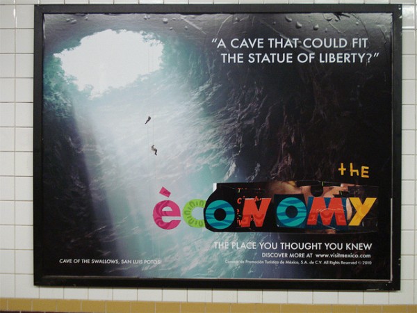
1. Razorboy: The Economy
Razorboy, also known as Posterboy, is a street artist based in New York City who uses a razor to slice up posters and billboards, to amazing effect (see also entry 10 and lead image).
By exposing the layers of older posters hidden under the top advertisement, he creates innovative, thought-provoking pieces of art, which he captures with a camera and places in his Flickr stream, so that the artworks last for longer than the advertising cycle. This image is both powerful and topical, illustrating the economy as being deep in a cave – a worry that most Americans must share.
