In today’s wacky world of advertising and rampant consumerism, a company must forever be changing in order to stay cutting edge. Attention spans grow shorter everyday, no thanks to the visual rape we are incessantly faced with; a constant barrage of billboards, taxi ads, commercials, YouTube commercials, popups on every website, and even plastered all over sporting events. Sometimes, in the race to stay ahead of the curve, companies hugely miscalculate what audiences want to see — and screw up big time. Here are 10 companies who made enormous branding mistakes.
Netflix/Qwikster
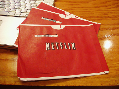
We all know and love Netflix. It seems like only yesterday when the company appeared from out of the abyss, simultaneously changing our lives with easy access to our favorite movies and digging the grave of such outmoded business models as “Blockbuster.” Later, when America had deemed even Natflix’s simple mail-order design to be too complicated, the company anticipated and satiated us with “Netflix Instant Play” allowing the world instantaneous access to the world of cinema at the click of a button.
It was hard to believe that they could make any mistakes over there… until we heard about Qwikster. The best ideas are simple ones — a principle that Netflix had exploited to great success in the past. Qwikster represented the ultimate in unnecessary and inconvenient change. The idea was as follows: split the company in two. One site, Netflix, would be an Instant Play computer movie watching services and Qwikster would handle the mail order DVDs and in the commotion of new logos and log-in pages up a few prices such as video game rentals.
The people were not hesitant to point out that this was an unwanted, unneeded and kind of unfair set of changes and Qwikster was born without a breath, consigned unto the history books alongside the cold, dead corpse of Blockbuster’s glory days.
Burger King King
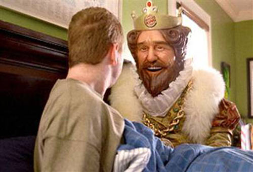
We all know Burger King, and most Americans have likely indulged in their delicious fast food treats — that is, when there’s no McDonald’s in sight. It’s no small wonder that McDonald’s has been so successful when its spokesman is a rather creepy, white-faced clown.
Burger King gets no such slack for a creepy mascot. A number of years ago they introduced the Burger King King, a mute and giant-faced medieval King who scared most people right off their whoppers. It wasn’t until 2011 that BK execs saw a correlation between dropping sales and the King’s off-putting silence. Meanwhile, Ronald McDonald continues to smirk.
Calvin Klein
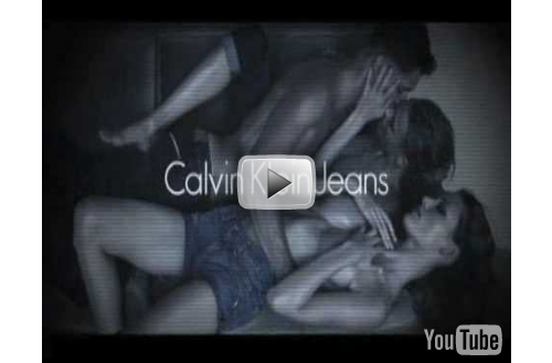
Sex sells. It’s the first thing you’ll learn in advertising school… but not the only thing. That’s what the execs at Calvin Klein failed to realize when they spent about 30 seconds translating this cheap marketing wisdom into one of the company’s most famously failed branding attempts.
In 2009 Calvin Klein released a number of video and print ads featuring a series of bizarre sexual images resembling the later hours at a High School party most of us were never quite cool enough to attend… you know the one, where sexy hairless denim lovers of all genders rub up on each other.
The ads were provocative, yes, but for the most part too alienating and uncomfortably arousing to get anyone thinking about their next denim purchase. They were quickly removed from the air.
Accenture

Oftentimes it’s a desperate exec’s attempt to be hip and cool that steers a company in the direction of branding disaster. Such desperation is never attractive or productive, and this reckless “hip” seeking when the company split from Arthur Andersen was clearly the motivating factor in turning a company called Andersen Consulting into one called Accenture.
Accenture means “Accent on the future,” but not really. The name itself conveys no readily accessible name. And while Andersen Consulting sounds like a company that owns a building filled with men and women who do things for people… Accenture conjures a more faceless set of images as well as other meaningless words like synergy and streamlining.
Considered to be one of the worst corporate rebrandings of all time, the Accenture name-change is estimated to have cost $100 MILLION dollars.
New Coke
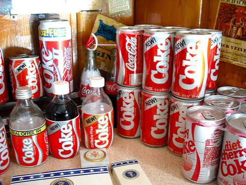
Coca-Cola, in addition to being one of the most successful brands in the country, is a deeply engrained cultural emblem symbolic of American values: of our proud past and of our bright future.
In 1985, amidst much pomp and circumstance, the company released a new version of the classic soft drink. New Coke was supposed to be “smoother, rounder yet bolder” but Americans saw all of this as a great tampering rather than an improvement. Would you improve the American flag? Would you edit the Bible? No? Then why change Coca-Cola??
New Coke was failing to sell and consumers were selling black market cases of classic Coke for as much as $30 dollars as a case. It didn’t take long for Coca-Cola to realize it’s mistake and go back to doing what they did best… producing the same brown sugar sludge that had rotted our teeth for decades.
Lost in Translation
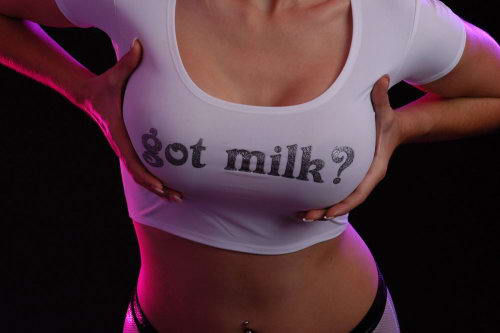
A number of major marketing blunders come from simple errors in translation. While it’s amazing to consider that ad campaigns, those silly little business ventures that cost millions and millions of dollars, could actually overlook something as central as, you know, the meaning of the words they print in their ads.
But it happens all the time. The Coors “Turn it loose” slogan translated into a Spanish idiom for diarrhea. Perdue Chicken’s slogan “It takes a strong man to make a tender chicken” was translated in Spanish to “It takes an aroused man to make a chicken affectionate,” and Mexican consumers read the translated “Got Milk?” as “Are you lactating?”
Microsoft Blue Screen of Death
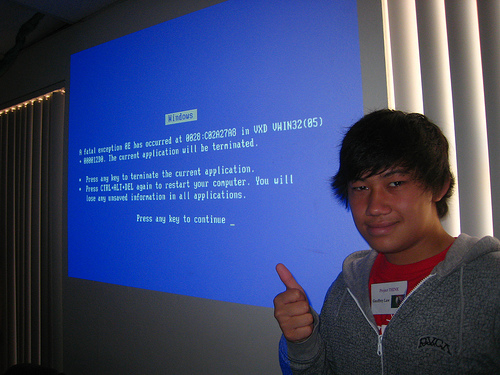
It should be some comfort for Bill Gates to know that Microsoft wasn’t simply buried by Apple’s innovation and superior brand appeal. That might make him feel weak and out of control. Microsoft was also buried by Microsoft. Not only did they lose their ability to make their product seem comparatively hip, hot and oh-so-indispensable, but they made a crucial error during an equally crucial marketing opportunity.
Most of us are familiar with Apple’s signature “Wheel of Death”, a spinning rainbow pie that signifies the end of a computer’s functionality. Our parents might recall a similar phenomenon called the Blue Screen of Death, a Microsoft based harbinger of frustration and doom. When the Blue Screen of Death appears, you’re done for.
At a pre-release screening of Windows 98 for an audience of press members, stunned onlookers chortled as the Blue Screen appeared and Microsoft employees blushed as their new program crashed before their eyes.
Yesterday and Today
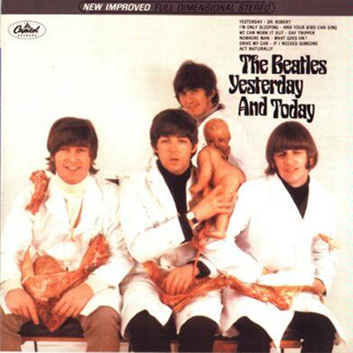
This branding disaster might come as a comfort to some who are tired of hearing nothing but praise for the Beatles. I mean, come on, they weren’t Gods among men. Just musicians with nerdy haircuts and the ability to make mistakes.
One notable mistake was the cover of their 66 album “Yesterday and Today.” Known as the “Butcher Cover,” it featured photographs of the rock stars in blood smeared butcher coats surrounded by raw red meat and dismembered baby dolls.
When the public was inevitably both shocked and dismayed, Capitol Records attempted a recall, eventually shipping replacement covers to many of the 750,000 consumers who had purchased the album.
Said George Harrison of the incident: “I thought it was gross, and I also thought it was stupid. Sometimes we all did stupid things thinking it was cool and hip when it was naive and dumb; and that was one of them.”
The Shack
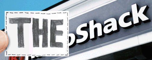
Some things will never, ever be cool. And one of those things is Radio Shack. Don’t get me wrong. We all love Radio Shack, the strip mall fixture which has dutifully provided us with batteries and clock radios throughout our lives, but it’s never going to be a very glamorous shopping experience. There are too many men with cell phone holsters on their belts in those stores for one thing.
But everyone just wants to be popular and Radio Shack is no exception. Of late Radio Shack has begun rebranding itself as “The Shack.” Why? Well, no one really knows. Perhaps it does sound a little cooler, but it also sounds more like a smoothie stand than an electronics distributor and does a place that already suffers from a reputation of being cheaper and less reliable than stores like “Best Buy,” really want to conjure the image of a ramshackle hut in every single ad they put out?
McDonald’s
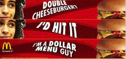
Double Cheeseburger? I’d Hit It.
So began a less than popular ad campaign released by McDonald’s in 2005. Don’t these people learn? “Ba-da-ba-ba-ba I’m lovin’ it” made McDonald’s food sound good. Before it completely erased the Justin Timberlake association with its own brand associations, that bit of jingle had us thinking that McDonald’s food was the kind of thing a hot male popstar’s heart would yearn for. After that we just knew that we wanted fries.
But what about “I’d Hit It” coupled with the smirking image of a 27 year old man with a ratty haircut? Does that make someone want fries? Who wouldn’t this dude hit it with?
The problem with this ad is that it’s just too real. Most of us don’t want to eat nasty, cheap, fatty McDonald’s food, but as we cruise down the highway late at night or walk home from the bars at 4 AM and pass those Golden Arches, we know that we would… and will… hit that.
But advertisements are about fantasy, so let’s stick with the idea that a Big Mac is something worth singing a love song to.
