Image: Lisa Yarost/Flickr
The American economy is in flux, to put it mildly. Especially if you compile individual conditions, like high unemployment and food-stamp usage, into a bigger picture. That’s just what we attempt to do with the 10 graphs in this post.
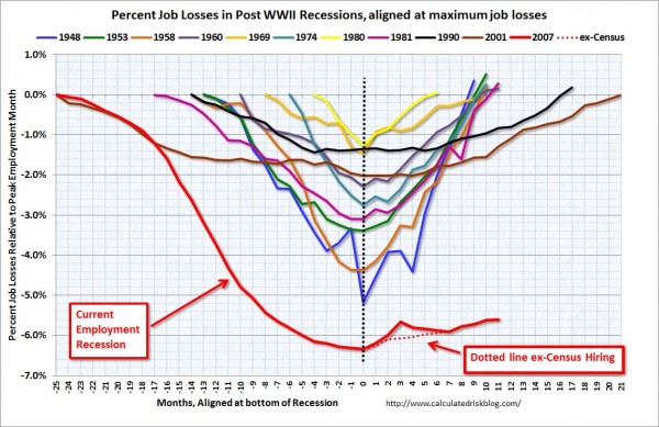
We’re All Unemployed
Chart source: Calculated Risk.
If you need any more proof that we’re in a big, fat recession, the unemployment numbers above should do the trick. 43.9% of unemployed people counted as long-term unemployed as of February 2011, meaning they’d been without work, but looking, for 27 weeks or more, according to the BLS. That translates to 6 million people. 8.3 million people are working part-time jobs because that’s all the work they can get.
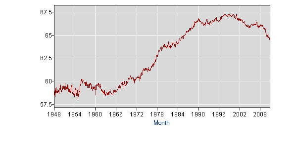
One million people count as “discouraged workers,” people who have looked for jobs but, due to lack of opportunities, have given up their search. Note that the government doesn’t apply these people to the unemployment rate, because people who aren’t looking for jobs, no matter the reason, don’t count. Our true employment rate is probably closer to 11% of the population than the official 9%. These “missing workers” mean that the labor force participation rate is around 64%.
Here’s a BLS chart on the labor force participation rate:
A Record Number of People are on Food Stamps
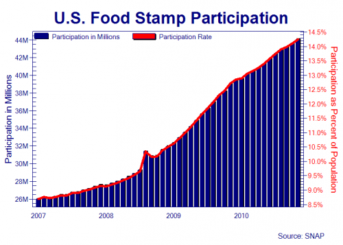
Chart source: Zero Hedge, 44.1 million people were receiving an average of $134/month in food stamps in December 2010.
The government initially created the food stamp program in 1939 as a way to help unemployed people eat. Now, most of a century and one full circle later, everybody’s unemployed again–and food stamps are hot.
“Food stamps” are more of a food card now: If your income is below the federal poverty line, or hovering at it, you can get a debit card with a $100+/month, government-paid food allowance. In 2009, 20,000 new people a day were getting them, a record not seen since the Great Depression.
With even supposedly high-falutin’ Orange County and Forsyth County residents clamoring for stamps, government-subsidized grocery shopping has gone mainstream. Roughly 50% of Americans receive food stamps at some point before they hit the age of 20, according to Washington University research cited in this New York Times article. More than one-fifth of the people living in Washington, D.C. and Mississippi use food stamps, according to Democracy Now.
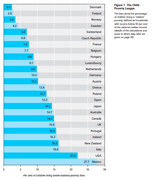
Our Child Poverty Rates Are High
Chart source: Child Poverty League
Poor kids are more likely to be unhealthy. Thanks to the ‘paradox of hunger and obesity,’ they’re also more likely to be poor. With expensive medical care, that poor health only feeds poverty and debt, creating a vicious circle.
Here are some more jarring child poverty statistics, from the National Center for Children in Poverty:
* Children comprise 25% of the US population, but 36% of impoverished people.
* 41% of all children (25.4 million) live in low-income families.
* 46% of toddlers (5.9 million) live in low-income families.
America is in Serious Debt
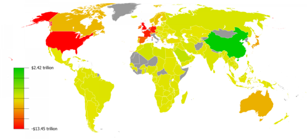
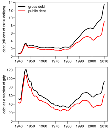
The Wikimedia Commons chart above shows countries’ foreign reserves minus their external debt. The charts below show how sharply our debt has increased during recent years.
Can you imagine the interest that comes with that debt? To cover it, we either need to print more money (a la QE1, 2 and 3) and/or increase taxes. In a sense, inflation is an “invisible tax,” too. When everything gets more expensive because of said interest payment management systems, we foresake spending money on other things. In a consumer spending-driven economy like ours, this makes me wonder how we’re going to pull off economic improvement at all.
We Heart Consumer Debt
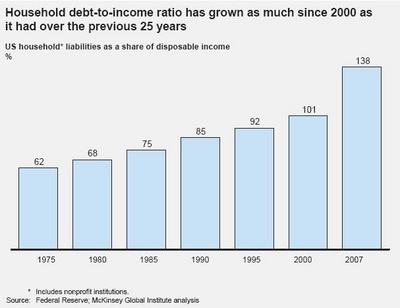
Chart source: Zero Hedge
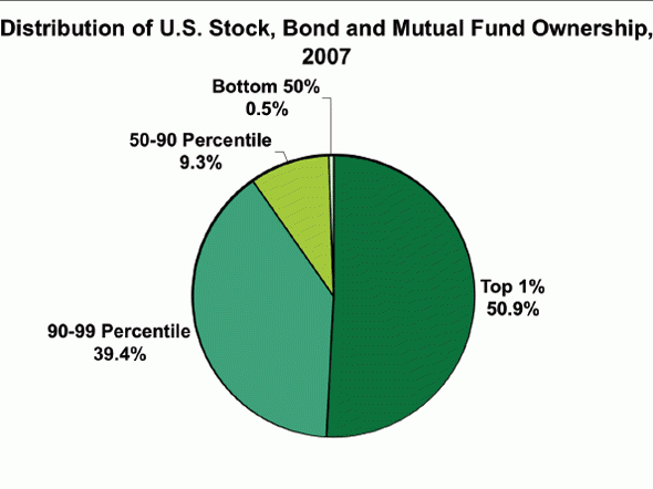
We, the indebted citizens of this indebted country, are taking on reams of individual debt to support the consumer spending that props up our indebted nation. Cashing out on refinances and home equity lines of credit fueled this problem in the noughties. More recently, consumers have been closing credit card accounts and saving money, mostly to fortify themselves in the face of steady unemployment and inflation, and also because it’s harder to get a loan from the bank or a HELOC. You might think this would hurt consumer spending, but the truth is that in an economy with as uneven a distribution of wealth as ours, the people on top who hold most of the money can actually bolster consumer spending more than the shrinking pool of middle-class savers.
We Don’t Perceive Inequality
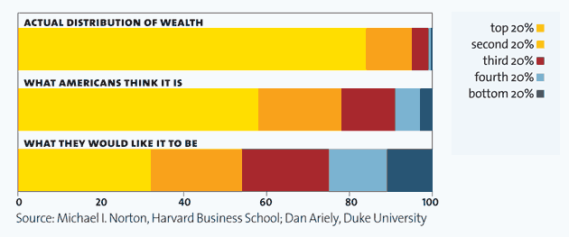
Chart source uncertain, but it was featured in both Mother Jones and the Washington Post.
Americans have always been an optimistic bunch. But does the deluded belief that a thin crust of people at the apex of the wealth pyramid don’t actually hold most of the country’s wealth, that it’s more evenly distributed than that, count as optimism? Or is it more of a foam pad to keep us from realizing that our country is actually a plutocracy?
If you’ve ever wondered why everyone around you seems to be downwardly mobile, but Wall Street keeps going up, the chart below might explain it.
(Chart source: Business Insider)
